��displayLarge
displayMedium�displaySmall
headlineLarge�headlineMedium
headlineSmall
titleLarge�titleMedium
titleSmall bodyLarge
bodyMedium bodySmall
labelLarge�labelMedium
labelSmall�copyWith�merge�apply�lerp�==�hashCode�debugFillProperties� TextThemeE
Typography�black�white�Theme�of�BuildContext ThemeData textTheme
typography�material2018�material2014 immutable�Diagnosticable TextStyle�Material�ElevatedButton
TextButton�OutlinedButton�displayLarge
displayMedium�displaySmall
headlineLarge�headlineMedium
headlineSmall
titleLarge�titleMedium
titleSmall bodyLarge
bodyMedium bodySmall
labelLarge�labelMedium
labelSmall�merge�inherit�String�List�double�Color�TextDecoration�TextDecorationStyle�apply�color�displayColor
decoration�decorationColor�decorationStyle
fontFamily�fontFamilyFallback�fontSizeFactor
fontSizeDelta�package bodyColor identical�lerp�override�bool�Object�runtimeType�int�hash�void�DiagnosticPropertiesBuilder�debugFillProperties�platform�defaultTargetPlatform�add�DiagnosticsProperty�defaultValue��Diagnosticable���–�ãJé�~n?ÅTá™�€ª��package:flutter/foundation.dart€Õ��package:flutter/painting.dart���typography.dart´]Àe`‚z=€ˆ€§€©€Ô€ý€ÿ�����=�B�‘�â‚/‚4‚|‚½‚ƒ�ƒUƒZƒöƒû„G„x„ã„è…2…•…Ù†�†n†“†˜†Å†Ê‡�‡N‡�‡Òˆ�ˆVˆ˜ˆÚ‰�‰^‰ ‰âŠ$ŠfŠ¨ŠŠü‹ ‹%‹t‹Å‹ë‹ðŒ?ŒˆŒÖ�)�j�Š���ž�£�ûŽKŽ€Ž±Ž½Žä���#�s�¾�ä�ë�&�-�z�È�Ï‘�‘l‘�‘¤‘¼‘Õ‘í’�’ ’9’O’f’|’‘’§’¼’Ò’é’ÿ“�“�“.“5“†“Ê“ì“î”�”�”p”´”×”Ù••�•X•œ•¾•À•ç•î–>–s–––˜–Öʗ�—O—s—u—�—¤—ô˜)˜L˜N˜r˜y˜È˜å™�™�™/™6™…™¢™Ã™Å™ê™ñš@š]š}šš¢š©šâ›�›�›*›1›j›q›Ÿ›¿›Á›å›ìœ%œDœFœjœqœ¿�
�1�8�…�¥�§�Ï�Öž$žrž–ž·ž¹žÞžåŸ3Ÿ�Ÿ¥ŸÅŸÇ � / 6 † × å ì¡�¡
¡�¡d¡°¡ë¢K¢R¢s¢�¢—¢ª¢Ø£�£'£J£~£Á£ç£û¤
¤�¤8¤F¤Q¤Z¤e¤x¤¤�¤—¤â¥'¥?¥]¥|¥š¥¹¥Ù¥ø¦�¦1¦M¦h¦„¦Ÿ¦»¦Ø¦ô¦ü§�§K§†§¾§ù¨7¨r¨¤¨Ù©�©:©l©›©Íª�ª4ª<ªAªCª”ªØªß«/«}«Å¬�¬�¬^¬®¬ý3:ƒÍ®�®f®‘®˜®¯®¶®Å¯�¯\¯“¯ï¯ö°�°4°;°N°|°¬°÷±E±•±â²�²}²Ð³�³�³�³#³6³=³N³U³Ÿ³ì´�´9´S´g´n´„´Øµ0µ„µÜ¶8¶�¶Ü·,·x·À¸�¸T¸ ¸ð¹<¹D¹I¹K¹™¹Ä¹Ëº�ºcºŸº¦ºö»G»U»j»ƒ»ª»À»â¼�¼�¼4¼U¼r¼�¼¥¼¼¼æ½�½%½P½{½œ½Í½ö¾�¾8¾B¾n¾Œ¾¾Ø¿�¿$¿U¿~¿¥¿À¿Ê¿ôÀ@�À@3À@^À@‰À@ªÀ@ÛÀA�ÀA+ÀAFÀAPÀA|ÀAšÀA»ÀAæÀB�ÀB2ÀBcÀBŒÀB³ÀBÎÀBØÀC�ÀC$ÀCEÀCpÀC›ÀC¼ÀCíÀD�ÀD=ÀDXÀDbÀDŽÀD©ÀDÊÀDõÀE ÀEAÀErÀE›ÀEÂÀEÝÀEçÀF
ÀF(ÀFIÀFtÀFŸÀFÀÀFñÀG�ÀGAÀG\ÀGfÀGŽÀG©ÀGÊÀGõÀH ÀHAÀHrÀH›ÀHÂÀHÝÀHçÀI
ÀI(ÀIIÀItÀIŸÀIÀÀIñÀJ�ÀJAÀJ\ÀJfÀJŠÀJ¥ÀJÆÀJñÀK�ÀK=ÀKnÀK—ÀK¾ÀKÙÀKãÀL ÀL$ÀLEÀLpÀL›ÀL¼ÀLíÀM�ÀM=ÀMXÀMbÀM†ÀM¤ÀMÅÀMðÀN�ÀN<ÀNmÀN–ÀN½ÀNØÀNâÀO�ÀO#ÀODÀOoÀOšÀO»ÀOìÀP�ÀP<ÀPWÀPaÀP‰ÀP¤ÀPÅÀPðÀQ�ÀQ<ÀQmÀQ–ÀQ½ÀQØÀQâÀR�ÀR#ÀRDÀRoÀRšÀR»ÀRìÀS�ÀS<ÀSWÀSaÀSiÀSnÀSpÀS¥ÀS¬ÀSÐÀT�ÀT:ÀTKÀTRÀTiÀT³ÀUÀUJÀU—ÀUçÀV4ÀVxÀV¿ÀW�ÀWDÀWˆÀWÉÀX
ÀXTÀX˜ÀX ÀX¥ÀX§ÀX´ÀXØÀXûÀY�ÀY�ÀYCÀYXÀY_ÀY~ÀY«ÀYÚÀZ�ÀZ6ÀZgÀZ–ÀZ¿ÀZêÀ[�À[:À[cÀ[ŠÀ[³À[ÞÀ\�À\
À\�À\�À\@À\SÀ\gÀ\zÀ\ŽÀ\£À\·À\ÈÀ\ÚÀ\ëÀ\ûÀ]�À]�À]-À]?À]PÀ]VÀ]XÀ]eÀ]«À]×À^;À^·À_6À_²À`1À`³Àa2Àa¨Àb!Àb—Àc
Àc€ÀcóÀdiÀdâÀeXÀe]Àe`�€©€Ô€ÿ���ÀdBŽÃ�ŽÃ�U/// Material design text theme.
///
/// Definitions for the various typographical styles found in Material Design
/// (e.g., labelLarge, bodySmall). Rather than creating a [TextTheme] directly,
/// you can obtain an instance as [Typography.black] or [Typography.white].
///
/// To obtain the current text theme, call [Theme.of] with the current
/// [BuildContext] and read the [ThemeData.textTheme] property.
///
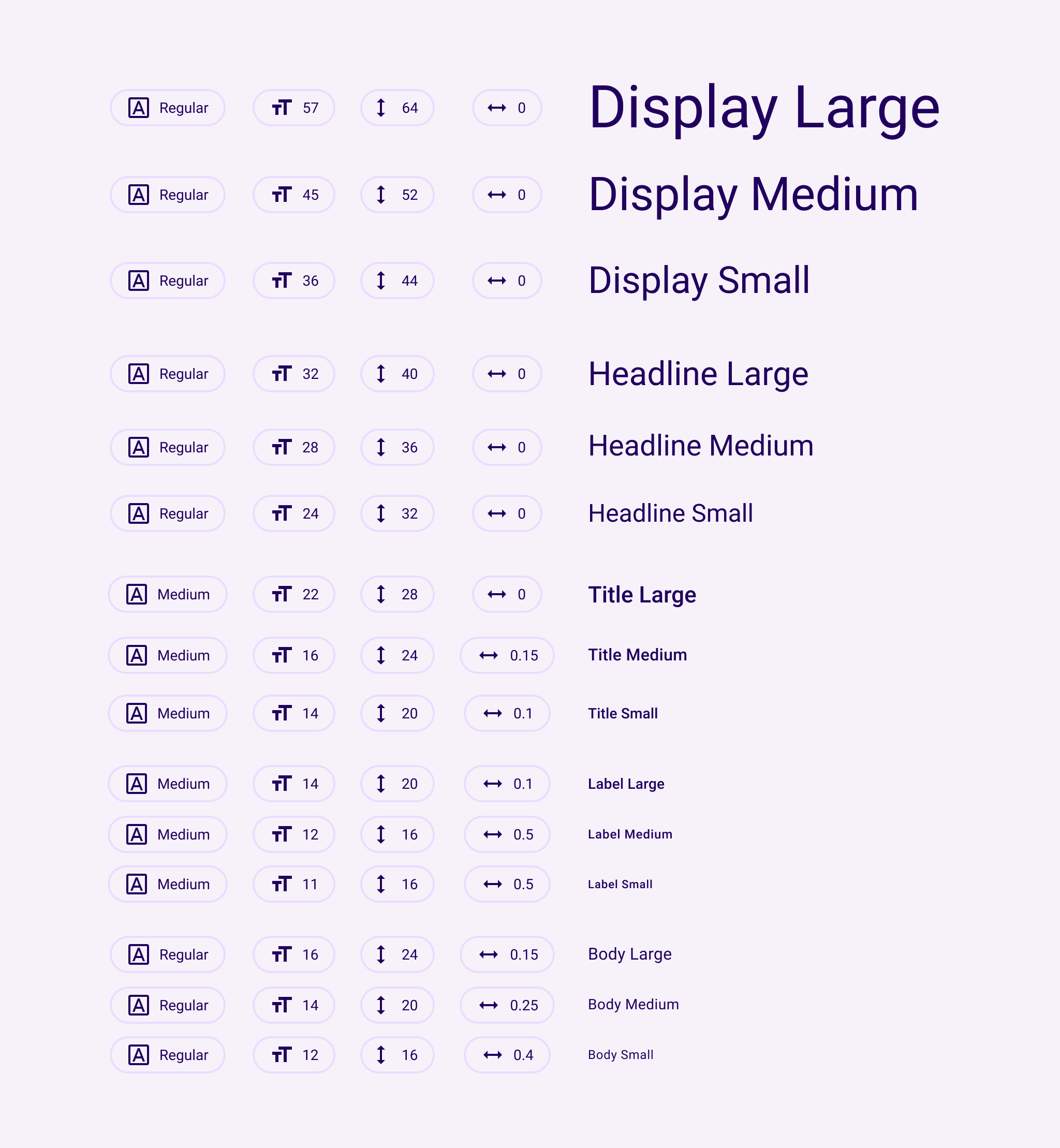
/// The names of the TextTheme properties match this table from the
/// [Material Design spec](https://m3.material.io/styles/typography/tokens).
///
/// 
///
/// The Material Design typography scheme was significantly changed in the
/// current (2021) version of the specification
/// ([https://m3.material.io/styles/typography/tokens](https://m3.material.io/styles/typography/tokens)).
///
/// The names of the 2018 TextTheme properties match this table from the
/// [Material Design spec](https://material.io/design/typography/the-type-system.html#type-scale)
/// with a few exceptions: the styles called H1-H6 in the spec are
/// displayLarge-titleLarge in the API chart, body1,body2 are called
/// bodyLarge and bodyMedium, caption is now bodySmall, button is labelLarge,
/// and overline is now labelSmall.
///
/// The 2018 spec has thirteen text styles:
///
/// | NAME | SIZE | WEIGHT | SPACING | |
/// |----------------|------|---------|----------|-------------|
/// | displayLarge | 96.0 | light | -1.5 | |
/// | displayMedium | 60.0 | light | -0.5 | |
/// | displaySmall | 48.0 | regular | 0.0 | |
/// | headlineMedium | 34.0 | regular | 0.25 | |
/// | headlineSmall | 24.0 | regular | 0.0 | |
/// | titleLarge | 20.0 | medium | 0.15 | |
/// | titleMedium | 16.0 | regular | 0.15 | |
/// | titleSmall | 14.0 | medium | 0.1 | |
/// | bodyLarge | 16.0 | regular | 0.5 | |
/// | bodyMedium | 14.0 | regular | 0.25 | |
/// | bodySmall | 12.0 | regular | 0.4 | |
/// | labelLarge | 14.0 | medium | 1.25 | |
/// | labelSmall | 10.0 | regular | 1.5 | |
///
/// ...where "light" is `FontWeight.w300`, "regular" is `FontWeight.w400` and
/// "medium" is `FontWeight.w500`.
///
/// By default, text styles are initialized to match the 2018 Material Design
/// specification as listed above. To provide backwards compatibility, the 2014
/// specification is also available.
///
/// To explicitly configure a [Theme] for the 2018 sizes, weights, and letter
/// spacings, you can initialize its [ThemeData.typography] value using
/// [Typography.material2018]. The [Typography] constructor defaults to this
/// configuration. To configure a [Theme] for the 2014 sizes, weights, and letter
/// spacings, initialize its [ThemeData.typography] value using
/// [Typography.material2014].
///
/// See also:
///
/// * [Typography], the class that generates [TextTheme]s appropriate for a platform.
/// * [Theme], for other aspects of a Material Design application that can be
/// globally adjusted, such as the color scheme.
/// * �Žæ„�‘—‘—�‘ ‚€/// Creates a text theme that uses the given values.
///
/// Rather than creating a new text theme, consider using [Typography.black]
/// or [Typography.white], which implement the typography styles in the
/// Material Design specification:
///
///
///
/// If you do decide to create your own text theme, consider using one of
/// those predefined themes as a starting point for [copyWith] or [apply].
///
/// The 2018 styles cannot be mixed with the 2021 styles. Only one or the
/// other is allowed in this constructor. The 2018 styles are deprecated and
/// will eventually be removed.�‘¨�‘®�‘‘À�‘Æ�‘Å‘Ù�‘ß�‘Þ‘ñ�‘÷�‘ö’
�’��’�’$�’*�’)’=�’C�’B’S�’Y�’X’j�’p�’o’€�’†�’…’•�’›�’š’«�’±�’°’À�’Æ�’Å’Ö�’Ü�’Û’í�’ó�’ò�“
€ß“Ý�“Ý€µ/// Largest of the display styles.
///
/// As the largest text on the screen, display styles are reserved for short,
/// important text or numerals. They work best on large screens.“ð€ä”Ç�”Ç€¹/// Middle size of the display styles.
///
/// As the largest text on the screen, display styles are reserved for short,
/// important text or numerals. They work best on large screens.”Û€à•¯�•¯€¶/// Smallest of the display styles.
///
/// As the largest text on the screen, display styles are reserved for short,
/// important text or numerals. They work best on large screens.•Â€Ñ–†�–†€¦/// Largest of the headline styles.
///
/// Headline styles are smaller than display styles. They're best-suited for
/// short, high-emphasis text on smaller screens.–š€Ö—b�—b€ª/// Middle size of the headline styles.
///
/// Headline styles are smaller than display styles. They're best-suited for
/// short, high-emphasis text on smaller screens.—w€Ò˜<�˜<€§/// Smallest of the headline styles.
///
/// Headline styles are smaller than display styles. They're best-suited for
/// short, high-emphasis text on smaller screens.˜P€²˜ø�˜ø€Š/// Largest of the title styles.
///
/// Titles are smaller than headline styles and should be used for shorter,
/// medium-emphasis text.™ €·™µ�™µ€Ž/// Middle size of the title styles.
///
/// Titles are smaller than headline styles and should be used for shorter,
/// medium-emphasis text.™Ç€³šp�šp€‹/// Smallest of the title styles.
///
/// Titles are smaller than headline styles and should be used for shorter,
/// medium-emphasis text.š�}šõ�šõY/// Largest of the body styles.
///
/// Body styles are used for longer passages of text.›�€·›²�›²€Œ/// Middle size of the body styles.
///
/// Body styles are used for longer passages of text.
///
/// The default text style for [Material].›Ã~œ8�œ8Z/// Smallest of the body styles.
///
/// Body styles are used for longer passages of text.œH�Z�˜��˜�)/// Largest of the label styles.
///
/// Label styles are smaller, utilitarian styles, used for areas of the UI
/// such as text inside of components or very small supporting text in the
/// content body, like captions.
///
/// Used for text on [ElevatedButton], [TextButton] and [OutlinedButton].�©��ž©�ž©€ß/// Middle size of the label styles.
///
/// Label styles are smaller, utilitarian styles, used for areas of the UI
/// such as text inside of components or very small supporting text in the
/// content body, like captions.ž»��Ÿ¸�Ÿ¸€Ü/// Smallest of the label styles.
///
/// Label styles are smaller, utilitarian styles, used for areas of the UI
/// such as text inside of components or very small supporting text in the
/// content body, like captions.�À\��CÀ\&�À\&�À\�À\��ŸÉŠv¥3�¥3„ç/// Creates a copy of this text theme but with the given fields replaced with
/// the new values.
///
/// Consider using [Typography.black] or [Typography.white], which implement
/// the typography styles in the Material Design specification, as a starting
/// point.
///
/// {@tool snippet}
///
/// ```dart
/// /// A Widget that sets the ambient theme's title text color for its
/// /// descendants, while leaving other ambient theme attributes alone.
/// class TitleColorThemeCopy extends StatelessWidget {
/// const TitleColorThemeCopy({super.key, required this.titleColor, required this.child});
///
/// final Color titleColor;
/// final Widget child;
///
/// @override
/// Widget build(BuildContext context) {
/// final ThemeData theme = Theme.of(context);
/// return Theme(
/// data: theme.copyWith(
/// textTheme: theme.textTheme.copyWith(
/// titleLarge: theme.textTheme.titleLarge!.copyWith(
/// color: titleColor,
/// ),
/// ),
/// ),
/// child: child,
/// );
/// }
/// }
/// ```
/// {@end-tool}
///
/// See also:
///
/// * [merge] is used instead of [copyWith] when you want to merge all
/// of the fields of a TextTheme instead of individual fields.�¥C�¥O�¥N¥a�¥m�¥l¥€�¥Œ�¥‹¥ž�¥ª�¥©¥½�¥É�¥È¥Ý�¥é�¥è¥ü�¦��¦�¦��¦$�¦#¦5�¦A�¦@¦Q�¦]�¦\¦l�¦x�¦w¦ˆ�¦”�¦“¦£�¦¯�¦®¦¿�¦Ë�¦Ê¦Ü�¦è�¦çªE��´��´�‰5/// Creates a new [TextTheme] where each text style from this object has been
/// merged with the matching text style from the `other` object.
///
/// The merging is done by calling [TextStyle.merge] on each respective pair
/// of text styles from this and the [other] text themes and is subject to
/// the value of [TextStyle.inherit] flag. For more details, see the
/// documentation on [TextStyle.merge] and [TextStyle.inherit].
///
/// If this theme, or the `other` theme has members that are null, then the
/// non-null one (if any) is used. If the `other` theme is itself null, then
/// this [TextTheme] is returned unchanged. If values in both are set, then
/// the values are merged using [TextStyle.merge].
///
/// This is particularly useful if one [TextTheme] defines one set of
/// properties and another defines a different set, e.g. having colors
/// defined in one text theme and font sizes in another, or when one
/// [TextTheme] has only some fields defined, and you want to define the rest
/// by merging it with a default theme.
///
/// {@tool snippet}
///
/// ```dart
/// /// A Widget that sets the ambient theme's title text color for its
/// /// descendants, while leaving other ambient theme attributes alone.
/// class TitleColorTheme extends StatelessWidget {
/// const TitleColorTheme({super.key, required this.child, required this.titleColor});
///
/// final Color titleColor;
/// final Widget child;
///
/// @override
/// Widget build(BuildContext context) {
/// ThemeData theme = Theme.of(context);
/// // This partialTheme is incomplete: it only has the title style
/// // defined. Just replacing theme.textTheme with partialTheme would
/// // set the title, but everything else would be null. This isn't very
/// // useful, so merge it with the existing theme to keep all of the
/// // preexisting definitions for the other styles.
/// final TextTheme partialTheme = TextTheme(titleLarge: TextStyle(color: titleColor));
/// theme = theme.copyWith(textTheme: theme.textTheme.merge(partialTheme));
/// return Theme(data: theme, child: child);
/// }
/// }
/// ```
/// {@end-tool}
///
/// See also:
///
/// * [copyWith] is used instead of [merge] when you wish to override
/// individual fields in the [TextTheme] instead of merging all of the
/// fields of two [TextTheme]s.�´$�´0�´/¹Mš�»a�»a�ë/// Creates a copy of this text theme but with the given field replaced in
/// each of the individual text styles.
///
/// The `displayColor` is applied to [displayLarge], [displayMedium],
/// [displaySmall], [headlineLarge], [headlineMedium], and [bodySmall]. The
/// `bodyColor` is applied to the remaining text styles.
///
/// Consider using [Typography.black] or [Typography.white], which implement
/// the typography styles in the Material Design specification, as a starting
/// point.
»n�»w�»v»‡ »–�»•»®�»·�»¶»Ä�»Ì�»Ë»æ�»î�»í¼��¼��¼�¼!�¼)�¼(¼8�¼I�¼H¼Y�¼a�¼`¼v$¼Œ�¼‹�»Ü»ýÀSr…1ÀSã�ÀSãV/// Linearly interpolate between two text themes.
///
/// {@macro dart.ui.shadow.lerp}�ÀSè�ÀSô�ÀSóÀSö�ÀT��ÀT�ÀT��ÀT��ÀT�ÀX©ƒbÀXÄ�ÀXÄ�ÀXÇ�ÀXÏ�ÀXÎ�ÀX©ÀXªÀ]Zˆ�À]l�À]l�À]€&À]��À]œ�À]ZÀ][�Ž±Ž²‚z=€ˆ€§€©€Ô€ý€ÿ�����=�B�‘�â‚/‚4‚|‚½‚ƒ�ƒUƒZƒöƒû„G„x„ã„è…2…•…Ù†�†n†“†˜†Å†Ê‡�‡N‡�‡Òˆ�ˆVˆ˜ˆÚ‰�‰^‰ ‰âŠ$ŠfŠ¨ŠŠü‹ ‹%‹t‹Å‹ë‹ðŒ?ŒˆŒÖ�)�j�Š���ž�£�ûŽKŽ€Ž±Ž½Žä���#�s�¾�ä�ë�&�-�z�È�Ï‘�‘l‘�‘¤‘¼‘Õ‘í’�’ ’9’O’f’|’‘’§’¼’Ò’é’ÿ“�“�“.“5“†“Ê“ì“î”�”�”p”´”×”Ù••�•X•œ•¾•À•ç•î–>–s–––˜–Öʗ�—O—s—u—�—¤—ô˜)˜L˜N˜r˜y˜È˜å™�™�™/™6™…™¢™Ã™Å™ê™ñš@š]š}šš¢š©šâ›�›�›*›1›j›q›Ÿ›¿›Á›å›ìœ%œDœFœjœqœ¿�
�1�8�…�¥�§�Ï�Öž$žrž–ž·ž¹žÞžåŸ3Ÿ�Ÿ¥ŸÅŸÇ � / 6 † × å ì¡�¡
¡�¡d¡°¡ë¢K¢R¢s¢�¢—¢ª¢Ø£�£'£J£~£Á£ç£û¤
¤�¤8¤F¤Q¤Z¤e¤x¤¤�¤—¤â¥'¥?¥]¥|¥š¥¹¥Ù¥ø¦�¦1¦M¦h¦„¦Ÿ¦»¦Ø¦ô¦ü§�§K§†§¾§ù¨7¨r¨¤¨Ù©�©:©l©›©Íª�ª4ª<ªAªCª”ªØªß«/«}«Å¬�¬�¬^¬®¬ý3:ƒÍ®�®f®‘®˜®¯®¶®Å¯�¯\¯“¯ï¯ö°�°4°;°N°|°¬°÷±E±•±â²�²}²Ð³�³�³�³#³6³=³N³U³Ÿ³ì´�´9´S´g´n´„´Øµ0µ„µÜ¶8¶�¶Ü·,·x·À¸�¸T¸ ¸ð¹<¹D¹I¹K¹™¹Ä¹Ëº�ºcºŸº¦ºö»G»U»j»ƒ»ª»À»â¼�¼�¼4¼U¼r¼�¼¥¼¼¼æ½�½%½P½{½œ½Í½ö¾�¾8¾B¾n¾Œ¾¾Ø¿�¿$¿U¿~¿¥¿À¿Ê¿ôÀ@�À@3À@^À@‰À@ªÀ@ÛÀA�ÀA+ÀAFÀAPÀA|ÀAšÀA»ÀAæÀB�ÀB2ÀBcÀBŒÀB³ÀBÎÀBØÀC�ÀC$ÀCEÀCpÀC›ÀC¼ÀCíÀD�ÀD=ÀDXÀDbÀDŽÀD©ÀDÊÀDõÀE ÀEAÀErÀE›ÀEÂÀEÝÀEçÀF
ÀF(ÀFIÀFtÀFŸÀFÀÀFñÀG�ÀGAÀG\ÀGfÀGŽÀG©ÀGÊÀGõÀH ÀHAÀHrÀH›ÀHÂÀHÝÀHçÀI
ÀI(ÀIIÀItÀIŸÀIÀÀIñÀJ�ÀJAÀJ\ÀJfÀJŠÀJ¥ÀJÆÀJñÀK�ÀK=ÀKnÀK—ÀK¾ÀKÙÀKãÀL ÀL$ÀLEÀLpÀL›ÀL¼ÀLíÀM�ÀM=ÀMXÀMbÀM†ÀM¤ÀMÅÀMðÀN�ÀN<ÀNmÀN–ÀN½ÀNØÀNâÀO�ÀO#ÀODÀOoÀOšÀO»ÀOìÀP�ÀP<ÀPWÀPaÀP‰ÀP¤ÀPÅÀPðÀQ�ÀQ<ÀQmÀQ–ÀQ½ÀQØÀQâÀR�ÀR#ÀRDÀRoÀRšÀR»ÀRìÀS�ÀS<ÀSWÀSaÀSiÀSnÀSpÀS¥ÀS¬ÀSÐÀT�ÀT:ÀTKÀTRÀTiÀT³ÀUÀUJÀU—ÀUçÀV4ÀVxÀV¿ÀW�ÀWDÀWˆÀWÉÀX
ÀXTÀX˜ÀX ÀX¥ÀX§ÀX´ÀXØÀXûÀY�ÀY�ÀYCÀYXÀY_ÀY~ÀY«ÀYÚÀZ�ÀZ6ÀZgÀZ–ÀZ¿ÀZêÀ[�À[:À[cÀ[ŠÀ[³À[ÞÀ\�À\
À\�À\�À\@À\SÀ\gÀ\zÀ\ŽÀ\£À\·À\ÈÀ\ÚÀ\ëÀ\ûÀ]�À]�À]-À]?À]PÀ]VÀ]XÀ]eÀ]«À]×À^;À^·À_6À_²À`1À`³Àa2Àa¨Àb!Àb—Àc
Àc€ÀcóÀdiÀdâÀeXÀe]Àe`� TextTheme�ò+