��displayLarge
displayMedium�displaySmall
headlineLarge�headlineMedium
headlineSmall
titleLarge�titleMedium
titleSmall bodyLarge
bodyMedium bodySmall
labelLarge�labelMedium
labelSmall�copyWith�merge�apply�lerp�of primaryOf�==�hashCode�debugFillProperties� TextThemeM
Typography�black�white�of�BuildContext�Theme ThemeData textTheme
typography�material2018�material2014 immutable�Diagnosticable TextStyle�Material�ElevatedButton
TextButton�OutlinedButton�displayLarge
displayMedium�displaySmall
headlineLarge�headlineMedium
headlineSmall
titleLarge�titleMedium
titleSmall bodyLarge
bodyMedium bodySmall
labelLarge�labelMedium
labelSmall�merge�inherit�String�List�double�Color�TextDecoration�TextDecorationStyle�apply�color�displayColor
decoration�decorationColor�decorationStyle
fontFamily�fontFamilyFallback�fontSizeFactor
fontSizeDelta�letterSpacingDelta�letterSpacingFactor�wordSpacingDelta�wordSpacingFactor�heightFactor�heightDelta�package bodyColor identical�lerp primaryOf�primaryTextTheme�override�bool�Object�runtimeType�int�hash�void�DiagnosticPropertiesBuilder�debugFillProperties�platform�defaultTargetPlatform�add�DiagnosticsProperty�defaultValue��Diagnosticable�9º
è
O{p^\þ$Ñ"ܧ��Œ��package:flutter/foundation.dart�·��package:flutter/widgets.dart�á�
theme.dart�÷��typography.dartÀA°À‚8ƒ_=€ˆ€§€©€Ñ€ò���>�\��‰�‹�¶�Þ�à�ö‚�‚�‚4‚9‚ˆ‚Ùƒ&ƒ+ƒwƒÁƒêƒï„4„‚„‡…#…(…t…¥†�†�†E†J†–†â‡.‡z‡Æˆ�ˆ^ˆªˆö‰B‰Ž‰ÚŠ&ŠrŠ¾‹
‹V‹[‹«‹°‹úŒ]Œ¡Œç�6�[�`�‘�–�ØŽ�Ž\ŽžŽà�"�d�¦�è�*�l�®�ð‘2‘t‘y‘È‘ì‘ñ’@’‘’·’¼“�“T“¢“õ”6”V”[”j”o”Ç•�•L•}•‰•°•è•ï–?–Š–°–·–ò–ù—F—”—›—è˜8˜[˜p˜ˆ˜¡˜¹˜Ò˜ì™�™�™2™H™]™s™ˆ™ž™µ™Ë™Ò™Ô™úš�šRš–š¸šºšäšë›<›€›£›¥›Ì›Óœ$œhœŠœŒœ³œº�
�?�b�d���–�æž�ž?žAžižpžÀžõŸ�Ÿ�Ÿ>ŸEŸ”Ÿ±ŸÑŸÓŸû � Q n � ‘ ¶ ½¡�¡)¡I¡K¡n¡u¡®¡Í¡Ï¡ö¡ý¢6¢=¢k¢‹¢�¢±¢¸¢ñ£�£�£6£=£‹£Ù£ý¤�¤Q¤q¤s¤›¤¢¤ð¥>¥b¥ƒ¥…¥ª¥±¥ÿ¦M¦q¦‘¦“¦ä¦û§�§R§£§±§¸§Ï§Ö§å¨0¨|¨·©�©�©?©\©c©v©¤©Ú©óª�ªJª�ª³ªÇªÙªé«�«�«�«&«1«D«K«\«c«®«ó¬�¬)¬H¬f¬…¬¥¬Ä¬à¬ý�4Pk‡¤ÀÈß®�®R®Š®Å¯�¯>¯p¯¥¯×°�°8°g°™°Î±±�±
±�±`±¤±«±û²I²‘²Ô²Û³*³z³É³ÿ´�´O´™´áµ2µ]µdµ{µ‚µ‘µÜ¶(¶_¶»¶Â¶ã··�·�·H·x·Ã¸�¸a¸®¸ê¹I¹œ¹Ð¹Û¹ä¹ïº�º º�º!ºkº¸ºÞ»�»�»3»:»P»¤»ü¼P¼¨½�½\½¨½ø¾D¾Œ¾Ø¿ ¿l¿¼À@�À@�À@�À@�À@eÀ@�À@—À@àÀA/ÀAkÀArÀAÂÀB�ÀB!ÀB6ÀBOÀBvÀBŒÀB®ÀBÏÀBöÀC�ÀCAÀCeÀC…ÀC¤ÀC¾ÀCÕÀCöÀD�ÀD>ÀDFÀD]ÀD‡ÀD¥ÀDÆÀDñÀE�ÀE=ÀEnÀE—ÀE¾ÀEïÀF"ÀFOÀF~ÀF£ÀFÆÀFáÀFëÀG�ÀG5ÀGVÀG�ÀG¬ÀGÍÀGþÀH'ÀHNÀHÀH²ÀHßÀI�ÀI3ÀIVÀIqÀI{ÀI¥ÀIÃÀIäÀJ�ÀJ:ÀJ[ÀJŒÀJµÀJÜÀK
ÀK@ÀKmÀKœÀKÁÀKäÀKÿÀL ÀL5ÀLSÀLtÀLŸÀLÊÀLëÀM�ÀMEÀMlÀM�ÀMÐÀMýÀN,ÀNQÀNtÀN�ÀN™ÀNÇÀNåÀO�ÀO1ÀO\ÀO}ÀO®ÀO×ÀOþÀP/ÀPbÀP�ÀP¾ÀPãÀQ�ÀQ!ÀQ+ÀQWÀQrÀQ“ÀQ¾ÀQéÀR
ÀR;ÀRdÀR‹ÀR¼ÀRïÀS�ÀSKÀSpÀS“ÀS®ÀS¸ÀSÞÀSùÀT�ÀTEÀTpÀT‘ÀTÂÀTëÀU�ÀUCÀUvÀU£ÀUÒÀU÷ÀV�ÀV5ÀV?ÀVgÀV‚ÀV£ÀVÎÀVùÀW�ÀWKÀWtÀW›ÀWÌÀWÿÀX,ÀX[ÀX€ÀX£ÀX¾ÀXÈÀXîÀY ÀY*ÀYUÀY€ÀY¡ÀYÒÀYûÀZ"ÀZSÀZ†ÀZ³ÀZâÀ[�À[*À[EÀ[OÀ[sÀ[ŽÀ[¯À[ÚÀ\�À\&À\WÀ\€À\§À\ØÀ]�À]8À]gÀ]ŒÀ]¯À]ÊÀ]ÔÀ]úÀ^�À^6À^aÀ^ŒÀ^À^ÞÀ_�À_.À__À_’À_¿À_îÀ`�À`6À`QÀ`[À`À`�À`¾À`éÀa�Àa5ÀafÀa�Àa¶ÀaçÀb�ÀbGÀbvÀb›Àb¾ÀbÙÀbãÀc Àc$ÀcEÀcpÀc›Àc¼ÀcíÀd�Àd=ÀdnÀd¡ÀdÎÀdýÀe"ÀeEÀe`ÀejÀe’ÀeÀeÎÀeùÀf$ÀfEÀfvÀfŸÀfÆÀf÷Àg*ÀgWÀg†Àg«ÀgÎÀgéÀgóÀh�Àh4ÀhUÀh€Àh«ÀhÌÀhýÀi&ÀiMÀi~Ài±ÀiÞÀj
Àj2ÀjUÀjpÀjzÀj‚Àj‡Àj‰Àj¾ÀjÅÀjéÀk*ÀkSÀkdÀkkÀk‚ÀkÌÀl�ÀlcÀl°ÀmÀmMÀm‘ÀmØÀn�Àn]Àn¡ÀnâÀo&ÀomÀo±Ào¹Ào¾ÀoÀÀp�Àp Àp=ÀpDÀpUÀp°ÀpÖÀq#Àq%ÀqnÀquÀq|Àq·Àq¾ÀqÏÀr(ÀrBÀr�ÀrŸÀr¬ÀrÐÀróÀs�Às�Às;ÀsPÀsWÀsyÀs¨ÀsÙÀt�Àt9ÀtlÀt�ÀtÈÀtõÀu ÀuIÀutÀu�ÀuÈÀuõÀv�Àv#Àv%Àv2ÀvVÀviÀv}Àv�Àv¤Àv¹ÀvÍÀvÞÀvðÀw�Àw�Àw"Àw2ÀwCÀwUÀwfÀwlÀwnÀw{ÀwÁÀwíÀxQÀxfÀx�Àx¦Àx½ÀxïÀxùÀy�Ày�Ày=ÀyWÀyoÀy¢Ày¬Ày´ÀyÉÀyðÀz Àz ÀzRÀz\ÀzdÀzyÀz ÀzºÀzÒÀ{�À{�À{�À{,À{SÀ{nÀ{‡À{»À{ÅÀ{ÍÀ{âÀ| À|#À|;À|nÀ|xÀ|€À|•À|¼À|ÓÀ|èÀ}�À}"À}*À}?À}fÀ}~À}”À}ÅÀ}ÏÀ}×À}ìÀ~�À~*À~?À~oÀ~yÀ~�À~–À~ûÀ�À�À?ÀVÀkÀ›À¥ÀÀÂÀ€'À€/À€DÀ€kÀ€‚À€—À€ÇÀ€ÑÀ€ÙÀ€îÀ��À�-À�CÀ�tÀ�~À�†À�›À�ÂÀ�ÙÀ�îÀ‚�À‚(À‚0À‚5À‚8€Ï/// @docImport 'elevated_button.dart';
/// @docImport 'material.dart';
/// @docImport 'outlined_button.dart';
/// @docImport 'text_button.dart';
/// @docImport 'theme.dart';
/// @docImport 'theme_data.dart';��‹�¶�à�ö�‚�À€#•��•�“�/// Material design text theme.
///
/// Definitions for the various typographical styles found in Material Design
/// (e.g., labelLarge, bodySmall). Rather than creating a [TextTheme] directly,
/// you can obtain an instance as [Typography.black] or [Typography.white].
///
/// To obtain the current text theme, call [TextTheme.of] with the current
/// [BuildContext]. This is equivalent to calling [Theme.of] and reading
/// the [ThemeData.textTheme] property.
///
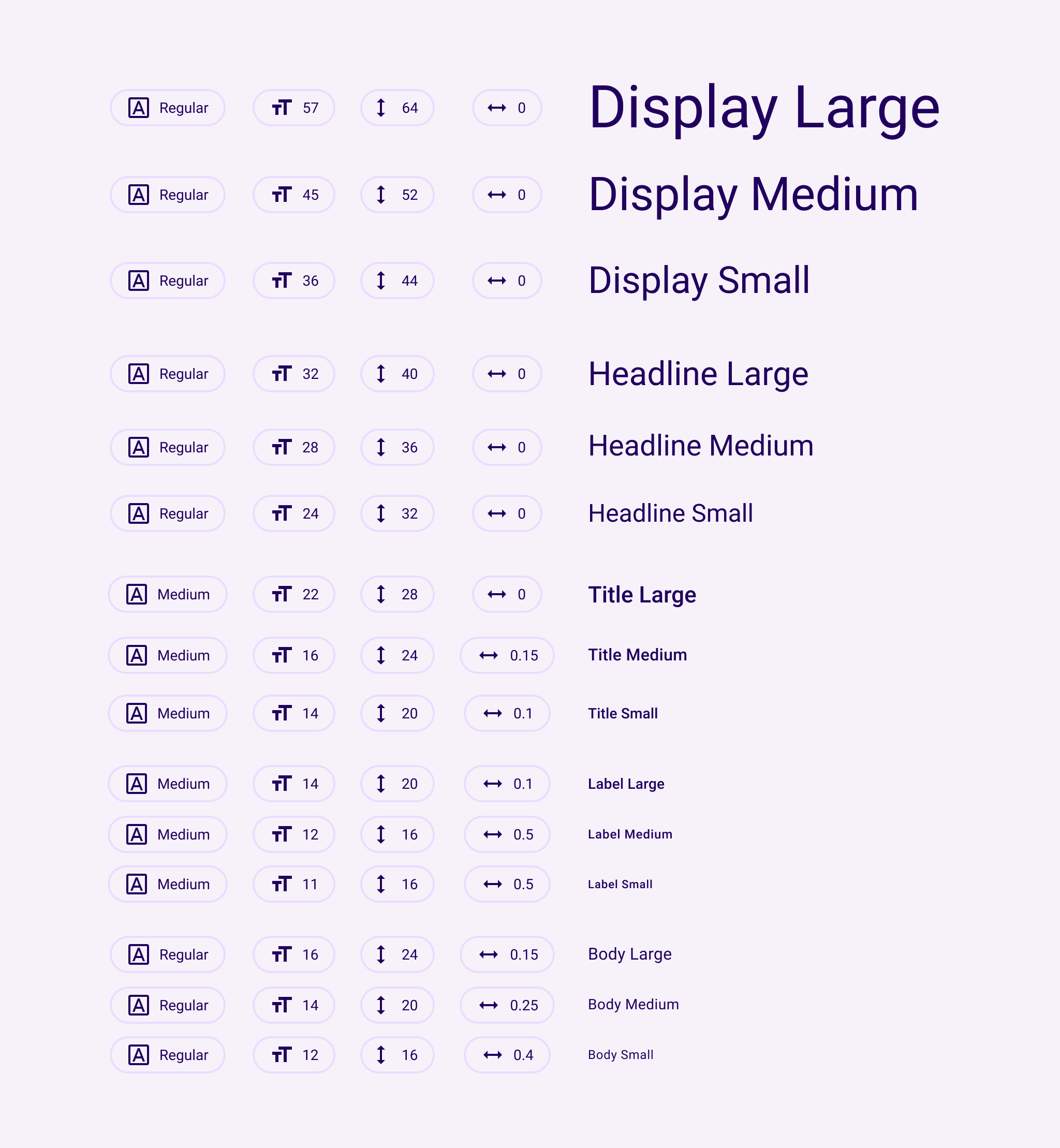
/// The names of the TextTheme properties match this table from the
/// [Material Design spec](https://m3.material.io/styles/typography/tokens).
///
/// 
///
/// The Material Design typography scheme was significantly changed in the
/// current (2021) version of the specification
/// ([https://m3.material.io/styles/typography/tokens](https://m3.material.io/styles/typography/tokens)).
///
/// The **2021** spec has fifteen text styles:
///
/// | NAME | SIZE | HEIGHT | WEIGHT | SPACING | |
/// |----------------|------|---------|---------|----------|-------------|
/// | displayLarge | 57.0 | 64.0 | regular | -0.25 | |
/// | displayMedium | 45.0 | 52.0 | regular | 0.0 | |
/// | displaySmall | 36.0 | 44.0 | regular | 0.0 | |
/// | headlineLarge | 32.0 | 40.0 | regular | 0.0 | |
/// | headlineMedium | 28.0 | 36.0 | regular | 0.0 | |
/// | headlineSmall | 24.0 | 32.0 | regular | 0.0 | |
/// | titleLarge | 22.0 | 28.0 | regular | 0.0 | |
/// | titleMedium | 16.0 | 24.0 | medium | 0.15 | |
/// | titleSmall | 14.0 | 20.0 | medium | 0.1 | |
/// | bodyLarge | 16.0 | 24.0 | regular | 0.5 | |
/// | bodyMedium | 14.0 | 20.0 | regular | 0.25 | |
/// | bodySmall | 12.0 | 16.0 | regular | 0.4 | |
/// | labelLarge | 14.0 | 20.0 | medium | 0.1 | |
/// | labelMedium | 12.0 | 16.0 | medium | 0.5 | |
/// | labelSmall | 11.0 | 16.0 | medium | 0.5 | |
///
/// ...where "regular" is `FontWeight.w400` and "medium" is `FontWeight.w500`.
///
/// The names of the 2018 TextTheme properties match this table from the
/// [Material Design spec](https://material.io/design/typography/the-type-system.html#type-scale)
/// with a few exceptions: the styles called H1-H6 in the spec are
/// displayLarge-titleLarge in the API chart, body1,body2 are called
/// bodyLarge and bodyMedium, caption is now bodySmall, button is labelLarge,
/// and overline is now labelSmall.
///
/// The **2018** spec has thirteen text styles:
///
/// | NAME | SIZE | WEIGHT | SPACING | |
/// |----------------|------|---------|----------|-------------|
/// | displayLarge | 96.0 | light | -1.5 | |
/// | displayMedium | 60.0 | light | -0.5 | |
/// | displaySmall | 48.0 | regular | 0.0 | |
/// | headlineMedium | 34.0 | regular | 0.25 | |
/// | headlineSmall | 24.0 | regular | 0.0 | |
/// | titleLarge | 20.0 | medium | 0.15 | |
/// | titleMedium | 16.0 | regular | 0.15 | |
/// | titleSmall | 14.0 | medium | 0.1 | |
/// | bodyLarge | 16.0 | regular | 0.5 | |
/// | bodyMedium | 14.0 | regular | 0.25 | |
/// | bodySmall | 12.0 | regular | 0.4 | |
/// | labelLarge | 14.0 | medium | 1.25 | |
/// | labelSmall | 10.0 | regular | 1.5 | |
///
/// ...where "light" is `FontWeight.w300`, "regular" is `FontWeight.w400` and
/// "medium" is `FontWeight.w500`.
///
/// By default, text styles are initialized to match the 2018 Material Design
/// specification as listed above. To provide backwards compatibility, the 2014
/// specification is also available.
///
/// To explicitly configure a [Theme] for the 2018 sizes, weights, and letter
/// spacings, you can initialize its [ThemeData.typography] value using
/// [Typography.material2018]. The [Typography] constructor defaults to this
/// configuration. To configure a [Theme] for the 2014 sizes, weights, and letter
/// spacings, initialize its [ThemeData.typography] value using
/// [Typography.material2014].
///
/// See also:
///
/// * [Typography], the class that generates [TextTheme]s appropriate for a platform.
/// * [Theme], for other aspects of a Material Design application that can be
/// globally adjusted, such as the color scheme.
/// * �•²„�˜c˜c�˜l‚€/// Creates a text theme that uses the given values.
///
/// Rather than creating a new text theme, consider using [Typography.black]
/// or [Typography.white], which implement the typography styles in the
/// Material Design specification:
///
///
///
/// If you do decide to create your own text theme, consider using one of
/// those predefined themes as a starting point for [copyWith] or [apply].
///
/// The 2018 styles cannot be mixed with the 2021 styles. Only one or the
/// other is allowed in this constructor. The 2018 styles are deprecated and
/// will eventually be removed.�˜t�˜z�˜y˜Œ�˜’�˜‘˜¥�˜«�˜ª˜½�˜Ã�˜Â˜Ö�˜Ü�˜Û˜ð�˜ö�˜õ™ �™��™�™��™%�™$™6�™<�™;™L�™R�™Q™a�™g�™f™w�™}�™|™Œ�™’�™‘™¢�™¨�™§™¹�™¿�™¾�™Ö€ßš©�š©€µ/// Largest of the display styles.
///
/// As the largest text on the screen, display styles are reserved for short,
/// important text or numerals. They work best on large screens.š¼€ä›“�›“€¹/// Middle size of the display styles.
///
/// As the largest text on the screen, display styles are reserved for short,
/// important text or numerals. They work best on large screens.›§€àœ{�œ{€¶/// Smallest of the display styles.
///
/// As the largest text on the screen, display styles are reserved for short,
/// important text or numerals. They work best on large screens.œŽ€Ñ�R��R€¦/// Largest of the headline styles.
///
/// Headline styles are smaller than display styles. They're best-suited for
/// short, high-emphasis text on smaller screens.�f€Öž.�ž.€ª/// Middle size of the headline styles.
///
/// Headline styles are smaller than display styles. They're best-suited for
/// short, high-emphasis text on smaller screens.žC€ÒŸ��Ÿ�€§/// Smallest of the headline styles.
///
/// Headline styles are smaller than display styles. They're best-suited for
/// short, high-emphasis text on smaller screens.Ÿ�€²ŸÄ�ŸÄ€Š/// Largest of the title styles.
///
/// Titles are smaller than headline styles and should be used for shorter,
/// medium-emphasis text.ŸÕ€· �� �€Ž/// Middle size of the title styles.
///
/// Titles are smaller than headline styles and should be used for shorter,
/// medium-emphasis text. “€³¡<�¡<€‹/// Smallest of the title styles.
///
/// Titles are smaller than headline styles and should be used for shorter,
/// medium-emphasis text.¡M}¡Á�¡ÁY/// Largest of the body styles.
///
/// Body styles are used for longer passages of text.¡Ñ€·¢~�¢~€Œ/// Middle size of the body styles.
///
/// Body styles are used for longer passages of text.
///
/// The default text style for [Material].¢�~£��£�Z/// Smallest of the body styles.
///
/// Body styles are used for longer passages of text.£��Z¤d�¤d�)/// Largest of the label styles.
///
/// Label styles are smaller, utilitarian styles, used for areas of the UI
/// such as text inside of components or very small supporting text in the
/// content body, like captions.
///
/// Used for text on [ElevatedButton], [TextButton] and [OutlinedButton].¤u��¥u�¥u€ß/// Middle size of the label styles.
///
/// Label styles are smaller, utilitarian styles, used for areas of the UI
/// such as text inside of components or very small supporting text in the
/// content body, like captions.¥‡��¦„�¦„€Ü/// Smallest of the label styles.
///
/// Label styles are smaller, utilitarian styles, used for areas of the UI
/// such as text inside of components or very small supporting text in the
/// content body, like captions.�Àv'�CÀv<�Àv<�Àv'Àv(�¦•Šv«ÿ�«ÿ„ç/// Creates a copy of this text theme but with the given fields replaced with
/// the new values.
///
/// Consider using [Typography.black] or [Typography.white], which implement
/// the typography styles in the Material Design specification, as a starting
/// point.
///
/// {@tool snippet}
///
/// ```dart
/// /// A Widget that sets the ambient theme's title text color for its
/// /// descendants, while leaving other ambient theme attributes alone.
/// class TitleColorThemeCopy extends StatelessWidget {
/// const TitleColorThemeCopy({super.key, required this.titleColor, required this.child});
///
/// final Color titleColor;
/// final Widget child;
///
/// @override
/// Widget build(BuildContext context) {
/// final ThemeData theme = Theme.of(context);
/// return Theme(
/// data: theme.copyWith(
/// textTheme: theme.textTheme.copyWith(
/// titleLarge: theme.textTheme.titleLarge!.copyWith(
/// color: titleColor,
/// ),
/// ),
/// ),
/// child: child,
/// );
/// }
/// }
/// ```
/// {@end-tool}
///
/// See also:
///
/// * [merge] is used instead of [copyWith] when you want to merge all
/// of the fields of a TextTheme instead of individual fields.�¬��¬��¬�¬-�¬9�¬8¬L�¬X�¬W¬j�¬v�¬u¬‰�¬•�¬”¬©�¬µ�¬´¬È�¬Ô�¬Ó¬ä�¬ð�¬ï��
����)�(8�D�CT�`�_o�{�z‹�—�–¨�´�³±���ºê�ºê‰5/// Creates a new [TextTheme] where each text style from this object has been
/// merged with the matching text style from the `other` object.
///
/// The merging is done by calling [TextStyle.merge] on each respective pair
/// of text styles from this and the [other] text themes and is subject to
/// the value of [TextStyle.inherit] flag. For more details, see the
/// documentation on [TextStyle.merge] and [TextStyle.inherit].
///
/// If this theme, or the `other` theme has members that are null, then the
/// non-null one (if any) is used. If the `other` theme is itself null, then
/// this [TextTheme] is returned unchanged. If values in both are set, then
/// the values are merged using [TextStyle.merge].
///
/// This is particularly useful if one [TextTheme] defines one set of
/// properties and another defines a different set, e.g. having colors
/// defined in one text theme and font sizes in another, or when one
/// [TextTheme] has only some fields defined, and you want to define the rest
/// by merging it with a default theme.
///
/// {@tool snippet}
///
/// ```dart
/// /// A Widget that sets the ambient theme's title text color for its
/// /// descendants, while leaving other ambient theme attributes alone.
/// class TitleColorTheme extends StatelessWidget {
/// const TitleColorTheme({super.key, required this.child, required this.titleColor});
///
/// final Color titleColor;
/// final Widget child;
///
/// @override
/// Widget build(BuildContext context) {
/// ThemeData theme = Theme.of(context);
/// // This partialTheme is incomplete: it only has the title style
/// // defined. Just replacing theme.textTheme with partialTheme would
/// // set the title, but everything else would be null. This isn't very
/// // useful, so merge it with the existing theme to keep all of the
/// // preexisting definitions for the other styles.
/// final TextTheme partialTheme = TextTheme(titleLarge: TextStyle(color: titleColor));
/// theme = theme.copyWith(textTheme: theme.textTheme.merge(partialTheme));
/// return Theme(data: theme, child: child);
/// }
/// }
/// ```
/// {@end-tool}
///
/// See also:
///
/// * [copyWith] is used instead of [merge] when you wish to override
/// individual fields in the [TextTheme] instead of merging all of the
/// fields of two [TextTheme]s.�ºð�ºü�ºûÀ@�ªlÀB-�ÀB-�ë/// Creates a copy of this text theme but with the given field replaced in
/// each of the individual text styles.
///
/// The `displayColor` is applied to [displayLarge], [displayMedium],
/// [displaySmall], [headlineLarge], [headlineMedium], and [bodySmall]. The
/// `bodyColor` is applied to the remaining text styles.
///
/// Consider using [Typography.black] or [Typography.white], which implement
/// the typography styles in the Material Design specification, as a starting
/// point.�ÀB:�ÀBC�ÀBBÀBS ÀBb�ÀBaÀBz�ÀBƒ�ÀB‚ÀB��ÀB˜�ÀB—ÀB²�ÀBº�ÀB¹ÀBÓ ÀBÛ�ÀBÚÀBú�ÀC��ÀC�ÀC �ÀC(�ÀC'ÀCE�ÀCM�ÀCLÀCi�ÀCq�ÀCpÀC‰�ÀC‘�ÀC�ÀC¨�ÀC°�ÀC¯ÀCÂ�ÀCÊ�ÀCÉÀCÙ�ÀCê�ÀCéÀCú�ÀD��ÀD�ÀD�$ÀD-�ÀD,�ÀB¨ÀBÉÀBðÀC�ÀC;ÀC_ÀCÀCžÀj‹…1Àjü�ÀjüV/// Linearly interpolate between two text themes.
///
/// {@macro dart.ui.shadow.lerp}�Àk��Àk
�Àk�Àk��Àk��Àk�Àk��Àk%�Àk$ÀoÂ�_Àpé�Àpé�/// The [ThemeData.textTheme] property of the ambient [Theme].
///
/// Equivalent to `Theme.of(context).textTheme`.
///
/// See also:
/// * [TextTheme.primaryOf], which returns the [ThemeData.primaryTextTheme] property of
/// the ambient [Theme] instead.�Àpì�Àpú�ÀpùÀq'�tÀrU�ÀrU��/// The [ThemeData.primaryTextTheme] property of the ambient [Theme].
///
///
/// Equivalent to `Theme.of(context).primaryTextTheme`.
///
/// See also:
/// * [TextTheme.of], which returns the [ThemeData.textTheme] property of the ambient
/// [Theme] instead.�Àr_�Àrm�ÀrlÀr¡ƒ€Àr¼�Àr¼�Àr¿�ÀrÇ�ÀrÆ�Àr¡Àr¢ÀwpŠÃÀw‚�Àw‚�Àw–&Àw³�Àw²�ÀwpÀwq�•}•~��€²���elevated_button.dart€Ú��
material.dart€û���outlined_button.dart�#���text_button.dart�G��
theme.dart�e���theme_data.dartƒ_=€ˆ€§€©€Ñ€ò���>�\��‰�‹�¶�Þ�à�ö‚�‚�‚4‚9‚ˆ‚Ùƒ&ƒ+ƒwƒÁƒêƒï„4„‚„‡…#…(…t…¥†�†�†E†J†–†â‡.‡z‡Æˆ�ˆ^ˆªˆö‰B‰Ž‰ÚŠ&ŠrŠ¾‹
‹V‹[‹«‹°‹úŒ]Œ¡Œç�6�[�`�‘�–�ØŽ�Ž\ŽžŽà�"�d�¦�è�*�l�®�ð‘2‘t‘y‘È‘ì‘ñ’@’‘’·’¼“�“T“¢“õ”6”V”[”j”o”Ç•�•L•}•‰•°•è•ï–?–Š–°–·–ò–ù—F—”—›—è˜8˜[˜p˜ˆ˜¡˜¹˜Ò˜ì™�™�™2™H™]™s™ˆ™ž™µ™Ë™Ò™Ô™úš�šRš–š¸šºšäšë›<›€›£›¥›Ì›Óœ$œhœŠœŒœ³œº�
�?�b�d���–�æž�ž?žAžižpžÀžõŸ�Ÿ�Ÿ>ŸEŸ”Ÿ±ŸÑŸÓŸû � Q n � ‘ ¶ ½¡�¡)¡I¡K¡n¡u¡®¡Í¡Ï¡ö¡ý¢6¢=¢k¢‹¢�¢±¢¸¢ñ£�£�£6£=£‹£Ù£ý¤�¤Q¤q¤s¤›¤¢¤ð¥>¥b¥ƒ¥…¥ª¥±¥ÿ¦M¦q¦‘¦“¦ä¦û§�§R§£§±§¸§Ï§Ö§å¨0¨|¨·©�©�©?©\©c©v©¤©Ú©óª�ªJª�ª³ªÇªÙªé«�«�«�«&«1«D«K«\«c«®«ó¬�¬)¬H¬f¬…¬¥¬Ä¬à¬ý�4Pk‡¤ÀÈß®�®R®Š®Å¯�¯>¯p¯¥¯×°�°8°g°™°Î±±�±
±�±`±¤±«±û²I²‘²Ô²Û³*³z³É³ÿ´�´O´™´áµ2µ]µdµ{µ‚µ‘µÜ¶(¶_¶»¶Â¶ã··�·�·H·x·Ã¸�¸a¸®¸ê¹I¹œ¹Ð¹Û¹ä¹ïº�º º�º!ºkº¸ºÞ»�»�»3»:»P»¤»ü¼P¼¨½�½\½¨½ø¾D¾Œ¾Ø¿ ¿l¿¼À@�À@�À@�À@�À@eÀ@�À@—À@àÀA/ÀAkÀArÀAÂÀB�ÀB!ÀB6ÀBOÀBvÀBŒÀB®ÀBÏÀBöÀC�ÀCAÀCeÀC…ÀC¤ÀC¾ÀCÕÀCöÀD�ÀD>ÀDFÀD]ÀD‡ÀD¥ÀDÆÀDñÀE�ÀE=ÀEnÀE—ÀE¾ÀEïÀF"ÀFOÀF~ÀF£ÀFÆÀFáÀFëÀG�ÀG5ÀGVÀG�ÀG¬ÀGÍÀGþÀH'ÀHNÀHÀH²ÀHßÀI�ÀI3ÀIVÀIqÀI{ÀI¥ÀIÃÀIäÀJ�ÀJ:ÀJ[ÀJŒÀJµÀJÜÀK
ÀK@ÀKmÀKœÀKÁÀKäÀKÿÀL ÀL5ÀLSÀLtÀLŸÀLÊÀLëÀM�ÀMEÀMlÀM�ÀMÐÀMýÀN,ÀNQÀNtÀN�ÀN™ÀNÇÀNåÀO�ÀO1ÀO\ÀO}ÀO®ÀO×ÀOþÀP/ÀPbÀP�ÀP¾ÀPãÀQ�ÀQ!ÀQ+ÀQWÀQrÀQ“ÀQ¾ÀQéÀR
ÀR;ÀRdÀR‹ÀR¼ÀRïÀS�ÀSKÀSpÀS“ÀS®ÀS¸ÀSÞÀSùÀT�ÀTEÀTpÀT‘ÀTÂÀTëÀU�ÀUCÀUvÀU£ÀUÒÀU÷ÀV�ÀV5ÀV?ÀVgÀV‚ÀV£ÀVÎÀVùÀW�ÀWKÀWtÀW›ÀWÌÀWÿÀX,ÀX[ÀX€ÀX£ÀX¾ÀXÈÀXîÀY ÀY*ÀYUÀY€ÀY¡ÀYÒÀYûÀZ"ÀZSÀZ†ÀZ³ÀZâÀ[�À[*À[EÀ[OÀ[sÀ[ŽÀ[¯À[ÚÀ\�À\&À\WÀ\€À\§À\ØÀ]�À]8À]gÀ]ŒÀ]¯À]ÊÀ]ÔÀ]úÀ^�À^6À^aÀ^ŒÀ^À^ÞÀ_�À_.À__À_’À_¿À_îÀ`�À`6À`QÀ`[À`À`�À`¾À`éÀa�Àa5ÀafÀa�Àa¶ÀaçÀb�ÀbGÀbvÀb›Àb¾ÀbÙÀbãÀc Àc$ÀcEÀcpÀc›Àc¼ÀcíÀd�Àd=ÀdnÀd¡ÀdÎÀdýÀe"ÀeEÀe`ÀejÀe’ÀeÀeÎÀeùÀf$ÀfEÀfvÀfŸÀfÆÀf÷Àg*ÀgWÀg†Àg«ÀgÎÀgéÀgóÀh�Àh4ÀhUÀh€Àh«ÀhÌÀhýÀi&ÀiMÀi~Ài±ÀiÞÀj
Àj2ÀjUÀjpÀjzÀj‚Àj‡Àj‰Àj¾ÀjÅÀjéÀk*ÀkSÀkdÀkkÀk‚ÀkÌÀl�ÀlcÀl°ÀmÀmMÀm‘ÀmØÀn�Àn]Àn¡ÀnâÀo&ÀomÀo±Ào¹Ào¾ÀoÀÀp�Àp Àp=ÀpDÀpUÀp°ÀpÖÀq#Àq%ÀqnÀquÀq|Àq·Àq¾ÀqÏÀr(ÀrBÀr�ÀrŸÀr¬ÀrÐÀróÀs�Às�Às;ÀsPÀsWÀsyÀs¨ÀsÙÀt�Àt9ÀtlÀt�ÀtÈÀtõÀu ÀuIÀutÀu�ÀuÈÀuõÀv�Àv#Àv%Àv2ÀvVÀviÀv}Àv�Àv¤Àv¹ÀvÍÀvÞÀvðÀw�Àw�Àw"Àw2ÀwCÀwUÀwfÀwlÀwnÀw{ÀwÁÀwíÀxQÀxfÀx�Àx¦Àx½ÀxïÀxùÀy�Ày�Ày=ÀyWÀyoÀy¢Ày¬Ày´ÀyÉÀyðÀz Àz ÀzRÀz\ÀzdÀzyÀz ÀzºÀzÒÀ{�À{�À{�À{,À{SÀ{nÀ{‡À{»À{ÅÀ{ÍÀ{âÀ| À|#À|;À|nÀ|xÀ|€À|•À|¼À|ÓÀ|èÀ}�À}"À}*À}?À}fÀ}~À}”À}ÅÀ}ÏÀ}×À}ìÀ~�À~*À~?À~oÀ~yÀ~�À~–À~ûÀ�À�À?ÀVÀkÀ›À¥ÀÀÂÀ€'À€/À€DÀ€kÀ€‚À€—À€ÇÀ€ÑÀ€ÙÀ€îÀ��À�-À�CÀ�tÀ�~À�†À�›À�ÂÀ�ÙÀ�îÀ‚�À‚(À‚0À‚5À‚8� TextTheme�cu